Images That Inspire my Decorating
So, admittedly, I have gotten a little carried away searching out interesting blogs and scrolling through images looking for something that catches my eye. Early last year I started a file of images that I labeled "Decorating Inspiration." As I was looking through it today, I was actually starting to get an idea of what my style really is. There are some very common themes. Take a look and see what I mean.
 I starred at the above image for a very long time, trying to think how I could make it for our living room. I think out home is just too small for something that large, but maybe on a small scale, we could pull it off in our home.
  It just looks like out kitchen, the colors and cheeriness strike me in a happy way.what I really love and it is barely pictured here, is the hood above the range. Good idea for our kitchen renovation. Hint to the mister.
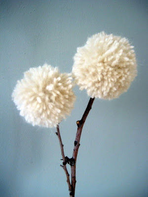
  My good friend, Bekah, sent this image to me and claimed she thoguht of me the moment she saw it. I, of course, love it and want to make a couple for our bathroom. I like the ruggedness and warmth of the wool stems. I think i ties in well with the following image for the same reasons.
  I seem to also be drawn to things that I or my very creative husband could make ourselves. Creating your own furniture of art is so rewarding. Stephen made our coffee table and I love it. It has a similar feel to that bed.
  Here we go again with the rugged kind of industrial feel. But I am not a lover of all things modern, just things that have cleaner, uncomplicated lines.
  These stools are more for Stephen than for me. He could totally make this and it would be the talk of all our guests, for sure.
  I LOVE, LOVE, LOVE the fireplace mantel and want one desperately above our fireplace. Another hint to the mister.
 So I guess the things that I can see represented in all these images are simple lines, playfulness, warmth without being cluttery, and a combination of rugged and industrial.


I like the mantle piece too. I already looks like it's in our living room. The sticks are fun. The ceiling there looks a lot taller. But you can make it work. Maybe even add some birds like the Beth mobile that's already hanging up. PCM has the strapping system that was used for thos crate benches. And the pallet bed would go great with the pallet table and chairs I built for our tent.
ReplyDeleteYou commented! Well, shiver me timbers! Thanks mister. You made my day. I love you!
ReplyDelete